Elementor Website Design: Build a Site That Converts

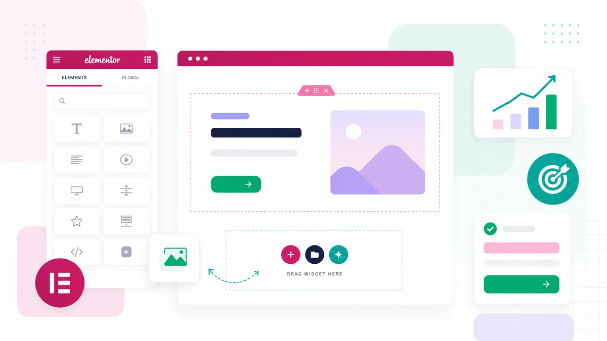
Elementor makes it possible to create visually distinctive WordPress pages without developing every component from scratch. But a successful Elementor website design is not measured by the number of animations, widgets, or decorative sections. It is measured by how clearly the website communicates, how smoothly it works, and how effectively it guides the right visitor toward action.
A conversion-focused website can still be creative. The difference is that every visual decision supports a business goal. The page hierarchy, spacing, copy, proof, buttons, forms, and mobile layout work together rather than competing for attention.
Start With One Primary Goal
Before opening the Elementor editor, define the main action the website should generate. This may be an enquiry, consultation booking, product purchase, quote request, newsletter subscription, or secure hire through Upwork.
A website can support several actions, but each page should have one primary purpose. A service page may encourage a quote request, while a case study may encourage the visitor to view related work and then contact the business.
Write the goal at the top of the project brief. When considering a new section, ask whether it helps visitors understand the offer, trust the business, or complete the next step. If it does none of these, it may not be necessary.
Build the Information Architecture Before the Visual Design
The page structure should follow how a potential customer thinks. Start with the main questions:
- What is this website about?
- Is the service relevant to me?
- Why should I trust this provider?
- What exactly is included?
- How does the process work?
- What will happen after I contact the business?
Create the sitemap and content outline before designing details. Important services deserve dedicated pages because they have different customer questions and search intent. A single page that briefly mentions ten unrelated services is difficult to optimize and difficult for visitors to understand.
Write a Hero Section That Communicates Immediately
The hero section is the first visible area on most pages. It should explain the offer quickly without forcing visitors to interpret abstract marketing language.
A strong Elementor hero normally includes:
- A clear H1 that names the service or outcome.
- A short supporting paragraph.
- One primary call to action.
- An optional secondary action, such as viewing the portfolio.
- A relevant image or visual.
- A concise trust signal, such as experience, reviews, or secure project handling.
Avoid placing several equal buttons, moving backgrounds, long paragraphs, and multiple badges above the fold. A focused hero helps visitors decide whether to continue.
Use a Logical Conversion-Focused Page Sequence
A useful service-page structure might be:
1. Hero with offer and call to action.
2. Problem or customer situation.
3. Service benefits and deliverables.
4. Process or working method.
5. Portfolio examples or case studies.
6. Testimonials and trust signals.
7. Frequently asked questions.
8. Final call to action.
The sequence can change, but the page should feel like a guided conversation. Elementor containers and templates make it easy to reorder and test sections without rebuilding the entire page.
Create a Simple Design System
Professional websites feel consistent because they use a limited set of visual rules. Configure global colors, typography, button styles, spacing, border radii, shadows, and container widths.
A practical system may include:
- One primary brand color.
- One accent color.
- Neutral text and background colors.
- One heading font and one body font, or a single versatile family.
- Consistent spacing increments.
- Standard button sizes and states.
- Reusable card, testimonial, and CTA components.
Global settings make future updates faster. If the brand color changes, the website should not require editing dozens of individual widgets.
Use Spacing to Improve Clarity
Crowded pages feel difficult even when the content is good. White space helps visitors recognize sections, scan headings, and focus on important actions.
Use consistent vertical spacing between sections and smaller spacing between related elements. Keep text lines at a readable width rather than stretching paragraphs across a large monitor. Align cards and buttons cleanly, but do not force every section into the same grid when the content requires a different rhythm.
Elementor's responsive controls should use sensible values rather than unrelated margins on every widget. Where possible, control spacing at the container level.
Make Typography Easy to Read
Typography creates hierarchy and affects trust. The H1 should be visually strong but not so large that it fills an entire mobile screen. Body text needs sufficient size, line height, and contrast.
Use headings in order: H1 for the page topic, H2 for major sections, and H3 for subsections. Do not select heading tags only for visual size. Elementor styling can change appearance without damaging the semantic structure.
Avoid using too many font weights. They add visual noise and can create extra downloads. Use bold text selectively to support scanning.
Design Mobile First, Not Mobile Last
A responsive Elementor website requires more than switching to the mobile preview at the end. Consider mobile behavior while planning each section.
On smaller screens:
- Stack content in the most useful order.
- Keep buttons large enough to tap.
- Reduce decorative images that do not support the message.
- Check long headings and form labels.
- Avoid horizontal overflow from fixed widths and negative margins.
- Keep popups, cookie banners, and sticky bars from covering content.
- Test menus, accordions, sliders, and video embeds.
Real-device testing is essential. Mobile browser controls, keyboards, and connection speed can reveal problems that the editor preview does not show.
Add Trust Where the Visitor Needs It
Trust is not one section placed near the footer. It should be supported throughout the page. Near the hero, a short statement about experience or secure hiring may reduce initial uncertainty. Near the service description, show relevant work. Near the form, explain the next step and privacy expectations.
Useful trust elements include:
- Real testimonials with context.
- Portfolio case studies.
- Client or industry experience.
- Clear contact and business information.
- A transparent process.
- Policies and secure payment options.
- Certifications or credentials when relevant.
Avoid unsupported claims such as "the best" or "guaranteed results." Specific proof is more persuasive.
Use Calls to Action Consistently
Buttons should describe what happens next. "Request a Website Review," "View WordPress Projects," or "Hire Me on Upwork" is clearer than "Click Here."
Use one primary visual style for the main action and a quieter style for secondary actions. Place calls to action after sections where a visitor may be ready to proceed, but do not add a large button after every paragraph.
The final CTA should repeat the value and remove uncertainty. Explain what information to send, how the project begins, and whether the first step is a consultation, audit, quote, or marketplace contract.
Keep Forms Short and Reliable
A lead form should collect enough information to qualify the request without feeling like a full project questionnaire. Name, email, website URL, service need, and a message are often enough for the first contact.
Use visible labels, clear error messages, spam protection, and a strong success message. Configure reliable email delivery through SMTP or a transactional provider. Test that the form reaches the correct inbox and that replies use the visitor's address safely.
If advertising campaigns depend on the form, track a confirmed submission or thank-you page. Tracking only the button click can record failed or incomplete attempts as conversions.
Protect Elementor Performance
A visually clean page can still be technically heavy. Large hero images, multiple add-on plugins, background videos, animated particles, maps, social feeds, and several font families can slow the first load.
Optimize images, use WebP, keep the container structure simple, and limit third-party widgets. Load videos after interaction when possible. Configure page caching and review scripts added by analytics, chat, consent, and advertising tools.
Google's Core Web Vitals focus on loading, responsiveness, and layout stability. Make sure the main hero content loads quickly, interactions respond without delay, and images or fonts do not cause the layout to jump.
Include Accessibility in the Design Process
Accessible design improves usability for many visitors and reduces avoidable barriers. Use sufficient color contrast, visible focus states, descriptive links, form labels, keyboard-friendly navigation, and meaningful alt text.
Decorative images should usually have empty alt text, while informative images should describe what matters in context. Do not communicate important information only through color. Check that accordions, popups, and menus can be used without a mouse.
Accessibility should be considered while building templates, not added as a final plugin after launch.
Build an SEO-Friendly Elementor Page
A strong Elementor design should support search visibility through:
- One clear page topic.
- A descriptive title tag and meta description.
- A logical H1-H3 hierarchy.
- Useful, original content.
- Crawlable internal links.
- Optimized images and alt text.
- Fast mobile performance.
- Canonical URLs and an XML sitemap.
- Appropriate structured data.
The focus keyword should appear naturally in the title, introduction, a relevant heading, and the conclusion when it fits. Avoid repeating the exact phrase in every section. Search engines need context and quality, not keyword stuffing.
Use Analytics and Testing After Launch
A design is a starting point. Review which pages receive traffic, where users leave, which calls to action are used, and whether forms produce qualified enquiries.
Test important changes carefully. A new hero headline, shorter form, different CTA, or clearer portfolio section may improve results. Avoid redesigning several elements at once when you want to understand what caused the improvement.
Qualitative feedback is also valuable. Ask real customers what they found clear or confusing. Support questions can reveal missing information that should be added to the website.
Common Elementor Design Mistakes
- Starting with a template before defining the website goal.
- Using vague hero copy.
- Adding too many animations and decorative widgets.
- Building inconsistent spacing on every section.
- Ignoring mobile until the end.
- Using several Elementor add-on packs for a few widgets.
- Hiding key information below long visual sections.
- Making every button look equally important.
- Publishing forms without testing email delivery.
- Optimizing for a score while breaking the customer journey.
Elementor Website Design Checklist
Before launch, review:
1. Does each page have one primary purpose?
2. Can a new visitor understand the offer within seconds?
3. Is the H1 clear and unique?
4. Are important services easy to find?
5. Is the design system consistent?
6. Does the mobile experience feel intentional?
7. Are trust elements specific and relevant?
8. Are calls to action descriptive?
9. Do forms work and deliver email reliably?
10. Are images, fonts, and scripts optimized?
11. Is the heading and internal-link structure SEO-friendly?
12. Are analytics and conversion events verified?
Frequently Asked Questions
Can Elementor create a professional business website?
Yes. Elementor can produce a professional result when it is combined with strong content, a consistent design system, responsive testing, optimized media, and clean development practices.
How many sections should a landing page have?
There is no universal number. Include enough sections to explain the offer, address concerns, provide proof, and guide action. Remove sections that repeat information or distract from the goal.
Does a conversion-focused design need aggressive sales tactics?
No. Clear messaging, useful information, trust, transparent next steps, and a simple form often convert better than pressure, fake urgency, or excessive popups.
Should I use an Elementor template kit?
A kit can speed up design, but it should be adapted to the business strategy, content, brand, performance needs, and mobile experience. Replacing demo text and colors is not a complete custom website process.
Final Thoughts
A high-performing Elementor website design combines strategy, content, visual hierarchy, trust, mobile usability, performance, accessibility, and SEO. Elementor provides the tools, but the quality comes from how those tools are used.
If your Elementor website looks attractive but does not generate enquiries, or if it has become slow and difficult to manage, send me the URL. I can review the structure and recommend a focused redesign through a secure Upwork project.
Continue Planning Your Website
Elementor Website Development
Professional Elementor websites with reusable sections, responsive layouts, and easy editing. Built cleanly so the site stays flexible without unnecessary bloat.
Explore Service Case StudyBeziehungsklarheit Website
A completed coaching and guidance website with a warm user experience, clear content structure, and service-focused presentation.
View Case Study GuideHow to Hire a Freelance WordPress Developer in 2026
A practical guide to hiring a freelance WordPress developer, comparing portfolios, defining scope, asking better questions, and starting a safer project.
Read Guide